Product Overview
Illumio is a cloud security company with a web application that allows users to secure their data centers by writing whitelist rules. These rules allow traffic between workloads that have Illumio’s software installed to monitor traffic. The web app allows visual analysis and editing of the rules.
The First Need
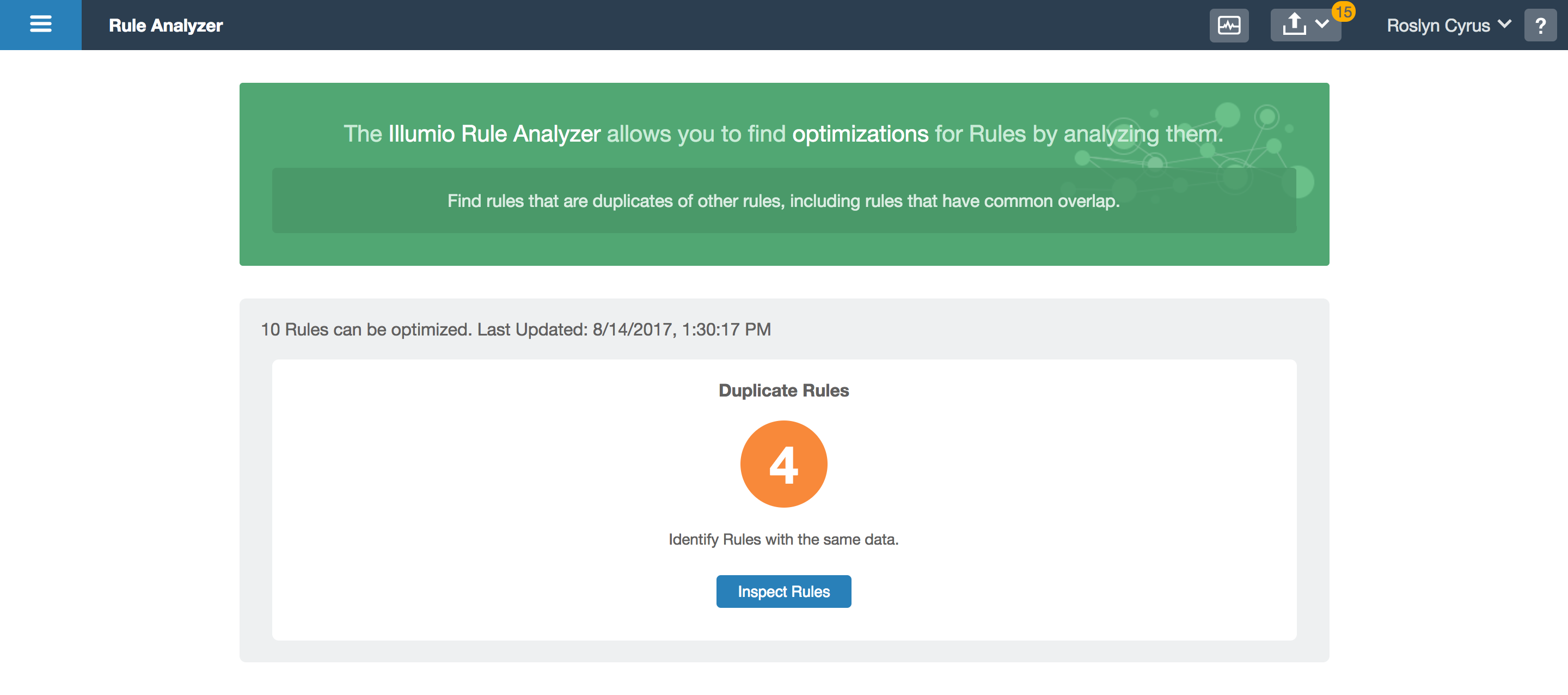
When changing a rule, users want to verify that the rules are indeed valid for certain workloads. Users also informed us that they want to ensure that they didn’t accidentally write a duplicate or superfluous rule. They needed a feature to validate which entities can talk to which and to see what is covered by a particular port, workload, or IP address.
My Goals
To make it clear which rules have redundancies to eliminate clutter. My primary focuses were ease of use and the ability to resolve redundancies quickly, a few or many at a time.
Mockups
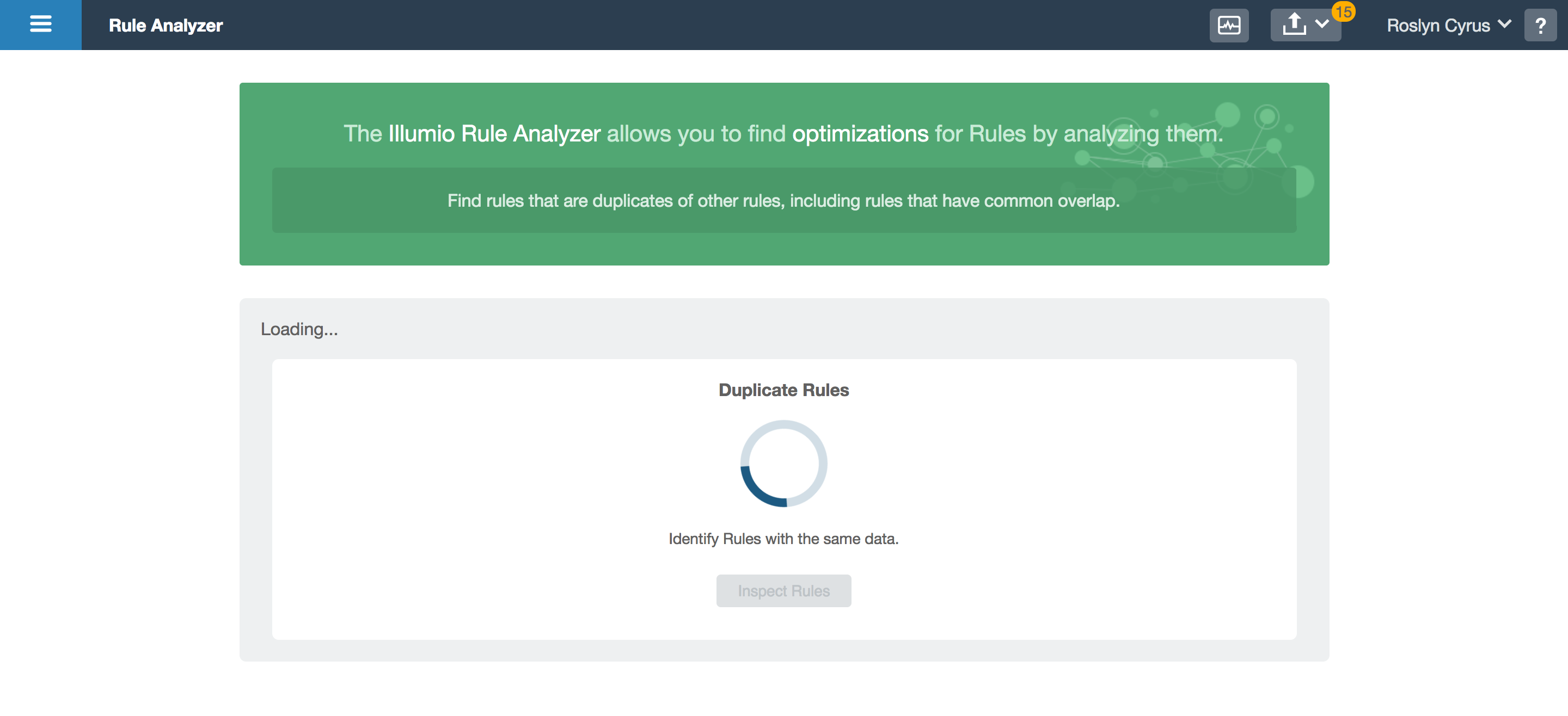
- Loading results
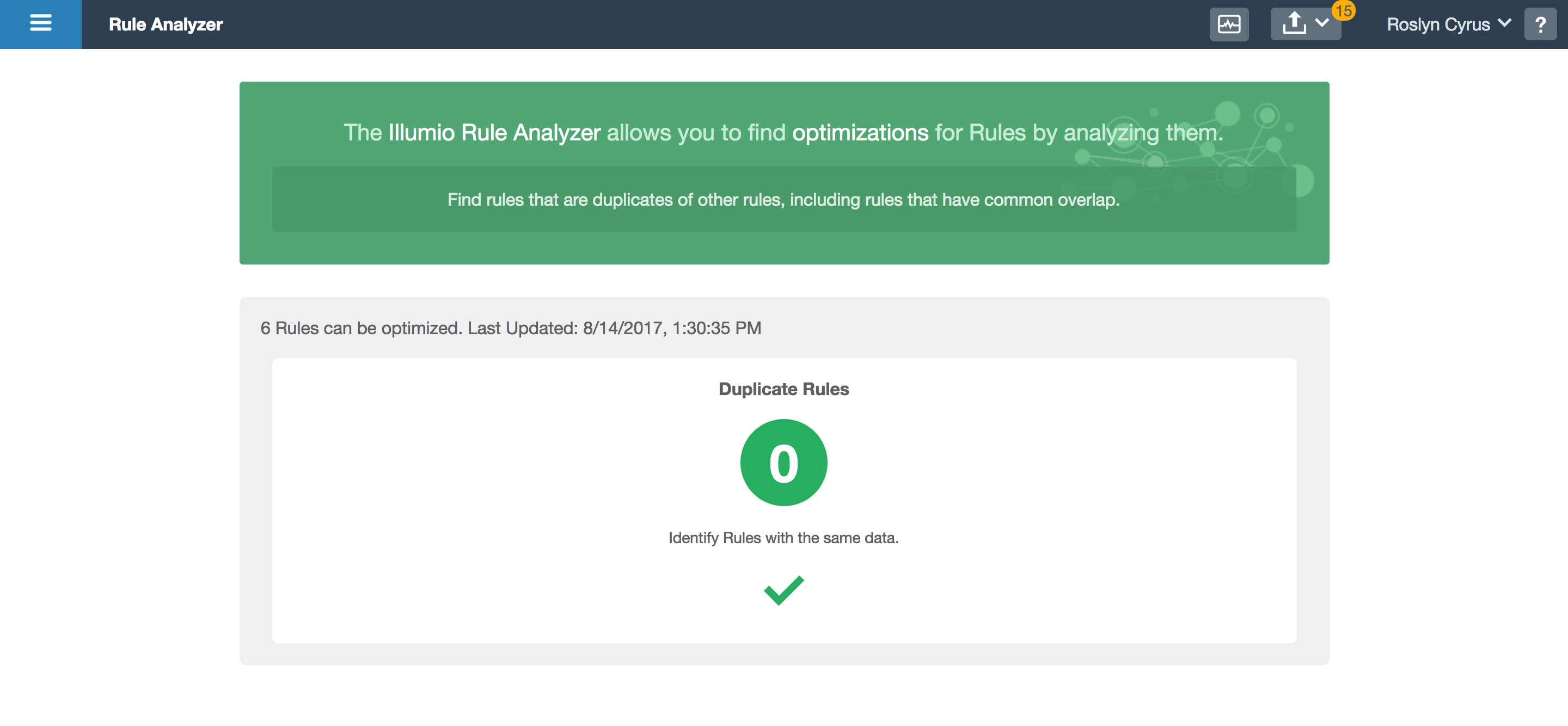
- All redundancies resolved
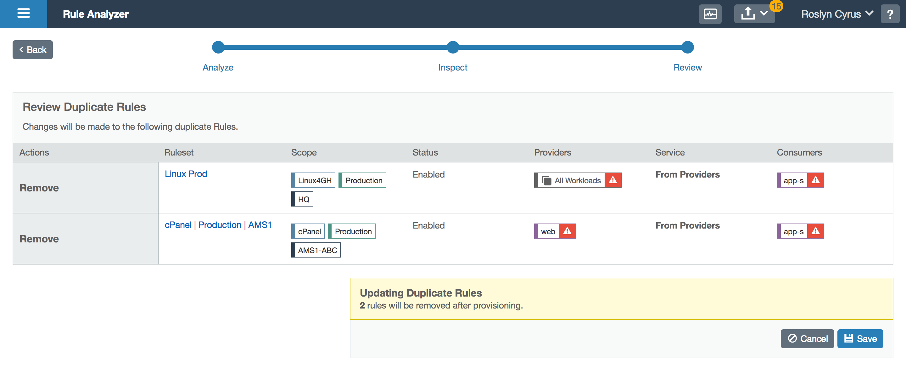
- Review changes
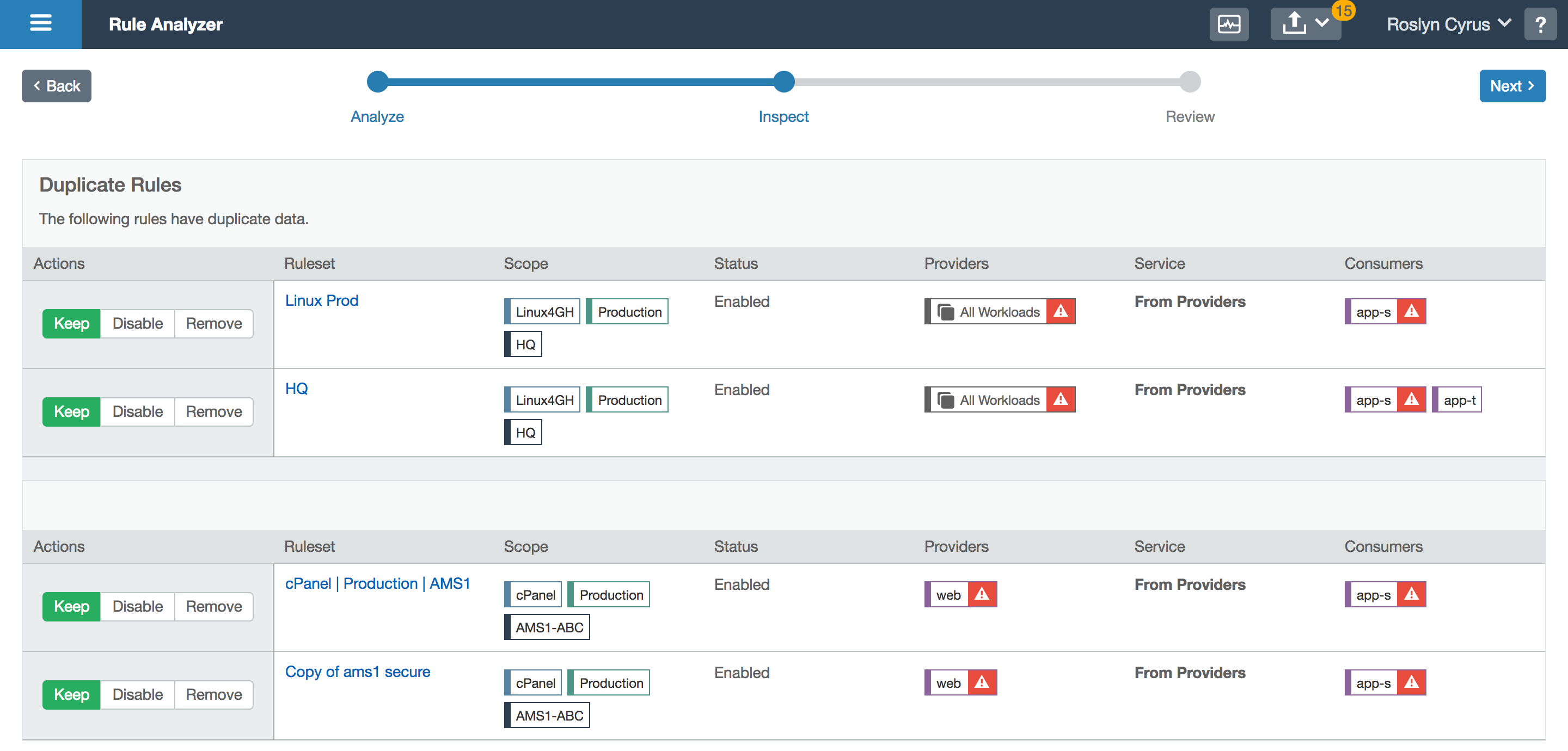
- Redundant rules
- Showing results
Design Synopsis
The user can get a count of how many rules are redundant. She can then view the rules in bulk and select which to resolve, which then takes her to a confirmation screen. Upon confirmation, the updated redundancy count is shown. This tool can be used as often as necessary, without forcing the user to resolve all redundancies in one sitting.
End Results + Prototype
After designing the feature, I prototyped it to get user feedback. Prototyping this feature also helped convey to the front end team exactly which interactions were needed. Also, since I programmed the prototype using React, the components were handoff-ready which saved the front end team a considerable amount of effort.
Prototyping this feature helped convey to the front end team exactly which interactions were needed. Also, since I programmed the prototype using React, the components were handoff-ready which saved the front end team a considerable amount of effort. This feature is currently being built into the product.
The Second Need
When writing rules, users oftentimes don’t understand the complexity behind what they are writing. Since rules allow traffic to communicate to a user’s workloads, it is crucial to ensure their understanding of how a rule affects their data center. I came up with a solution to address this issue.
My Goals
To make it explicit which and how many workloads are impacted when writing rules. My focus was on an intuitive visualization that would update in real time as the user makes changes. A bonus goal was to teach users best practices while writing rules.
Whiteboarding and Rules for Rule-Writing
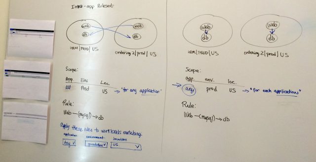
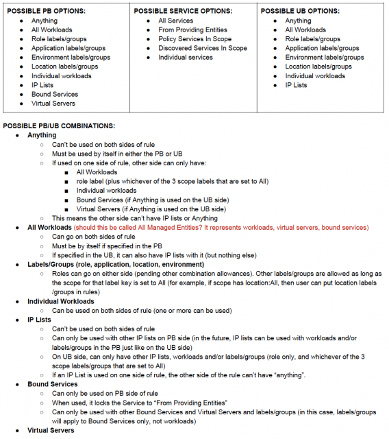
Whiteboarding became a very important part of this design. There are many use cases to consider for the visualization and I also needed to document the possibilities as I discovered them.
Mockups
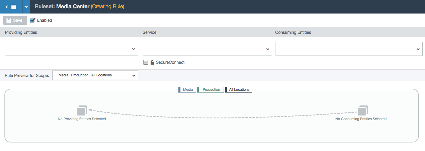
- User starts with a blank slate: an empty rule
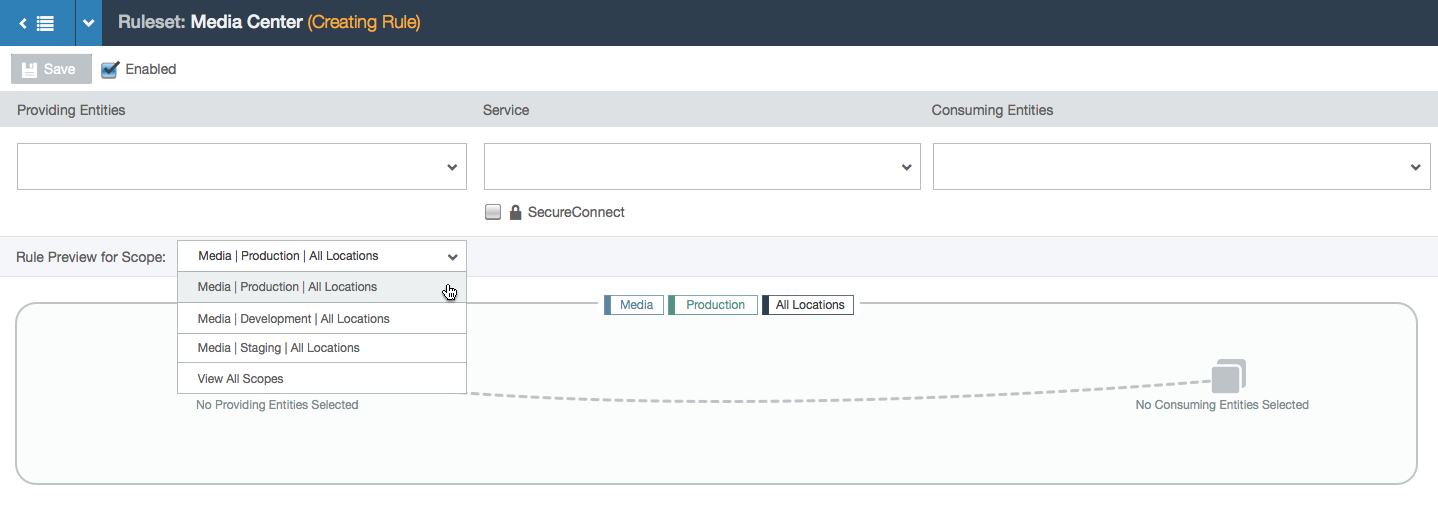
- User can choose which scope in the ruleset to write a rule for. Rules will apply only to the workloads that comprise that scope (by matching the labels specified in the scope).
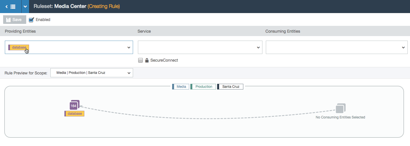
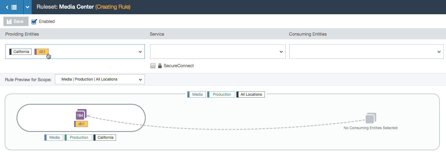
- User selects a provider label (labels represent a group of workloads with a common purpose: either the same environment, location, application, or role). A database group appears in the visualization with a count of how many workloads have that label. The rule isn’t complete yet so the line is still dashed.
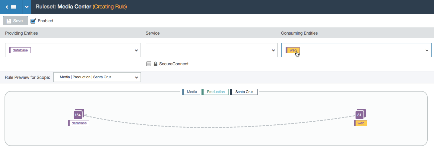
- User selects a consumer label.
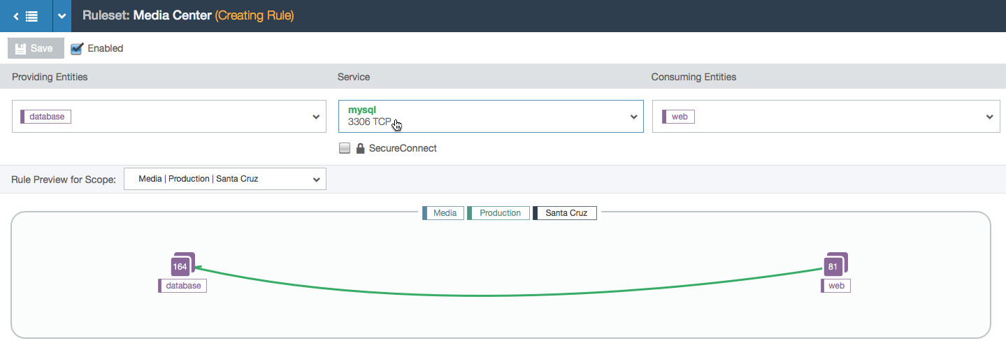
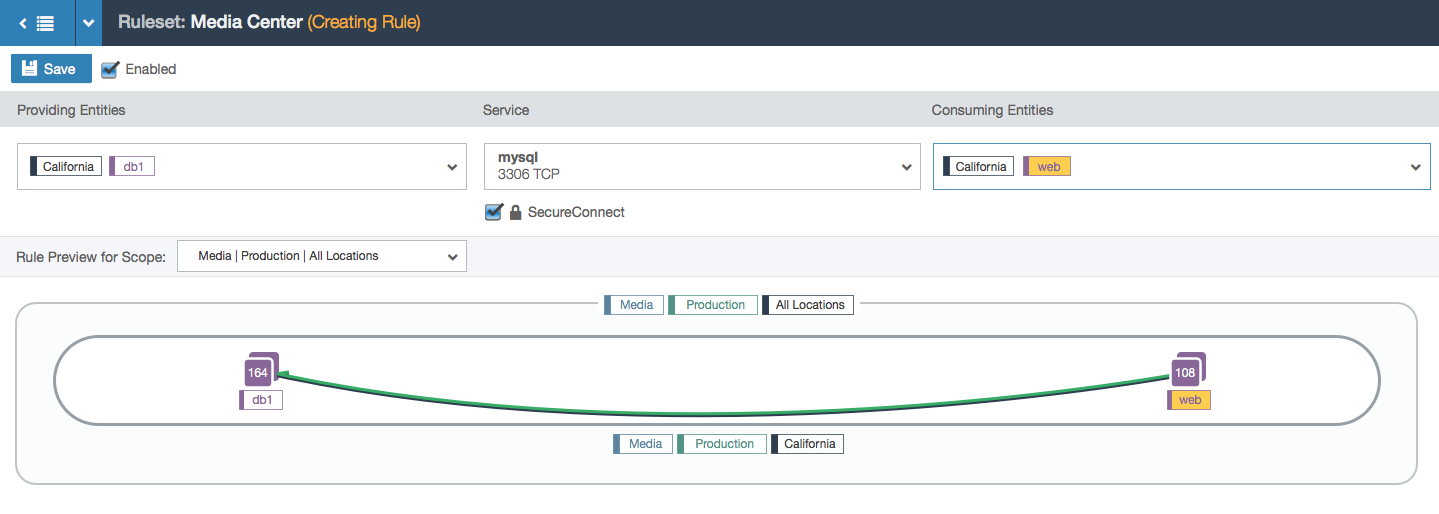
- User selects the service that the consumer is allowed to communicate to the providers with. The rule is now valid so the line between the consumers and providers turns green.
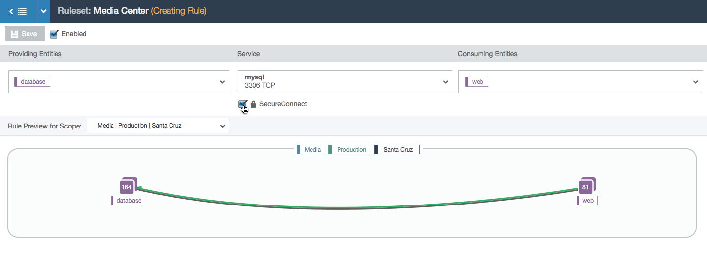
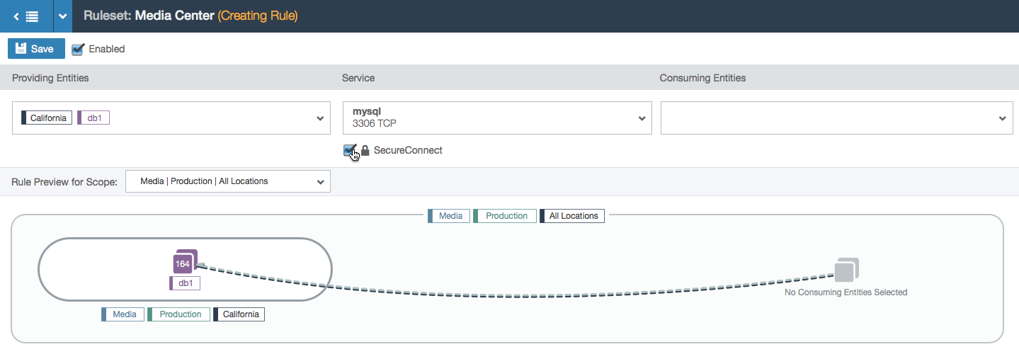
- SecureConnect is a feature that encrypts the data between the endpoints of the rule. When turned on, the line is reinforced with a shadow.
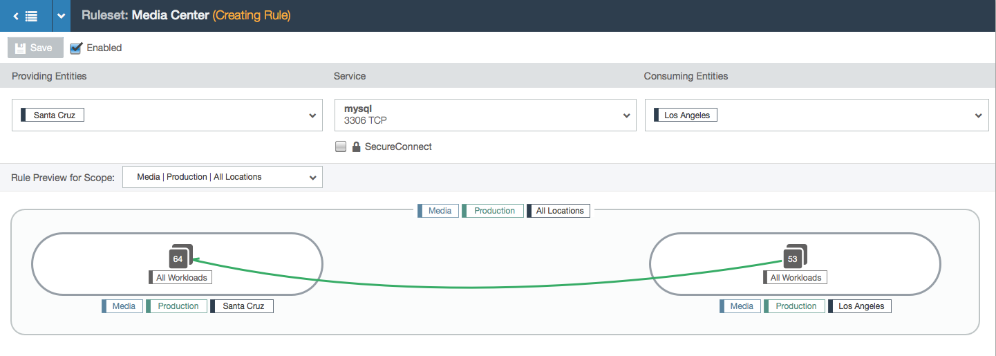
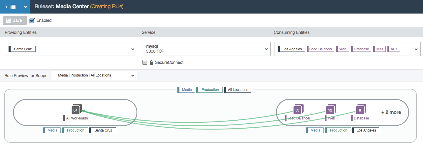
- In this example, the user is working within the Media, Production, and All Locations scope. This means that the user can specify a location for each side of the rule. In this case, the two chosen locations create a subset of all the Media and Production locations: the workloads with the labels Media, Production, and Los Angeles can communicate with the workloads labeled Media, Production, and Santa Cruz over port 3306 via TCP.
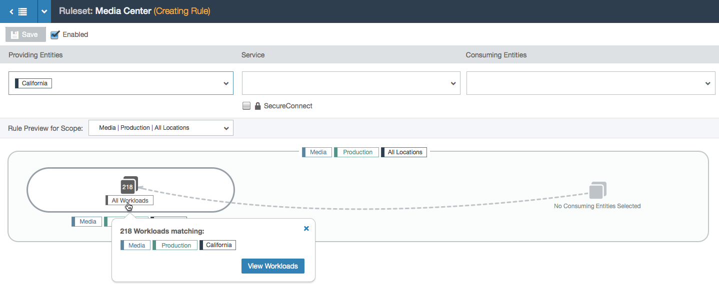
- Hovering over a node shows a tooltip with more information.
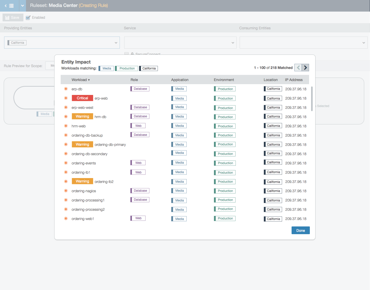
- Clicking on the button in the tooltip shows a modal with the list of workloads in that group.
- Because the role label is the focal point of rule-writing (the other three label types are part of the scope that represent the outer bubble of the visualization), selecting a rule in the left side of the rule will change the left node from “All Workloads” that are labeled Media, Production, and California to specifically the workloads labeled db1, Media, Production, and California.
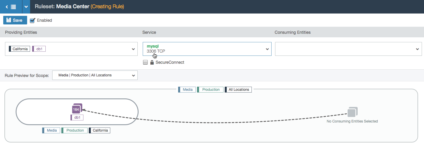
- If a service is selected but the rule is still incomplete, the dashed line becomes a darker color to show partial progress.
- Example of a partial rule with a service selected and SecureConnect enabled.
- A fully populated rule. Both sides of the rule have the California location label, so there is one subset bubble that represents the workloads that can receive communication from the consuming entities.
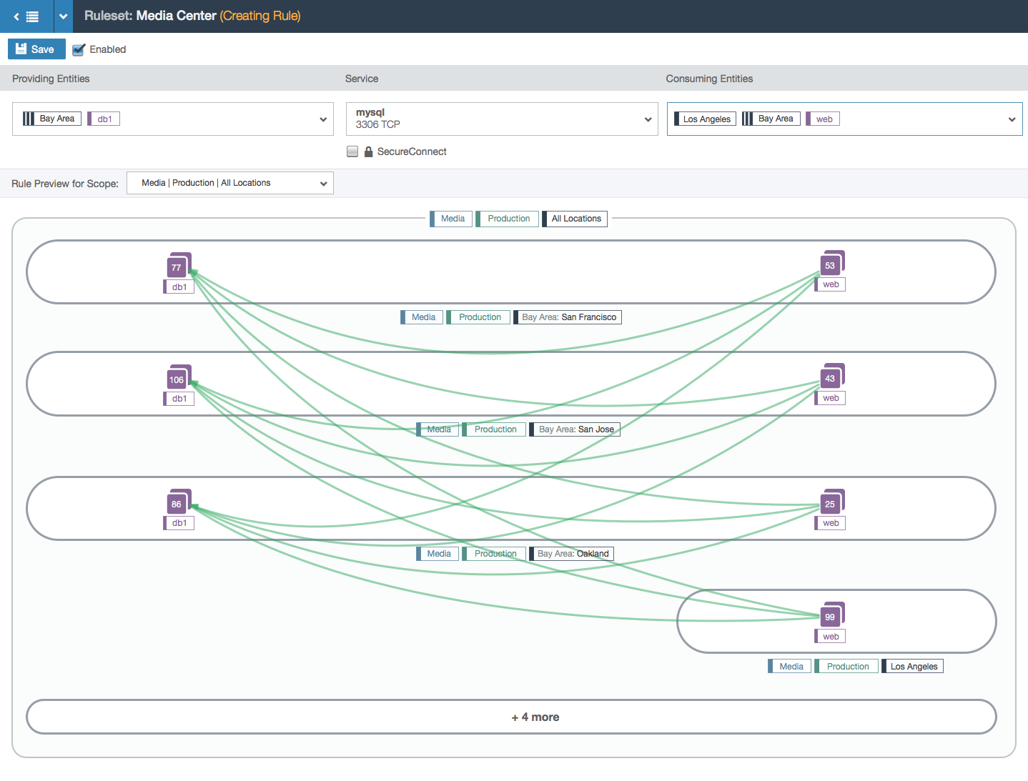
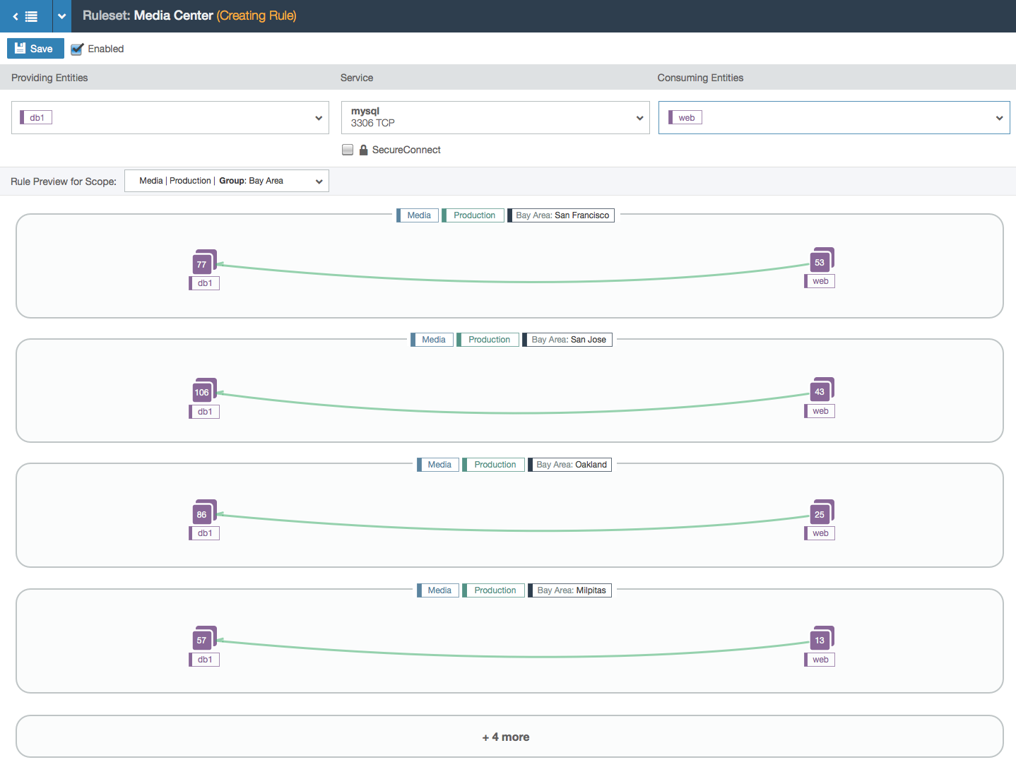
- This example shows a more complex rule. A label group (Bay Area) is used; label groups are shortcuts for writing more than one label. In this case, this label group several labels in it. After the first few examples, additional parts of the rule are collapsed into a text bubble at the bottom.
- In this example, note that the scope now has an explicit location set: the Bay Area label group. This example shows that cross-communication between bubbles is not allowed. Such intercommunication is only allowed between bubbles when label groups are used directly in the providing or consuming entities part of the rule. This distinction was a driving force behind this design because a lot of our users didn’t understand the implication of using label groups in the scope versus in the rule itself. The visualization makes it clearer.
- This example shows how a bubble with too many nodes will truncate the data to preserve the integrity of the bubble layout without losing the ability to understand what the rule does.
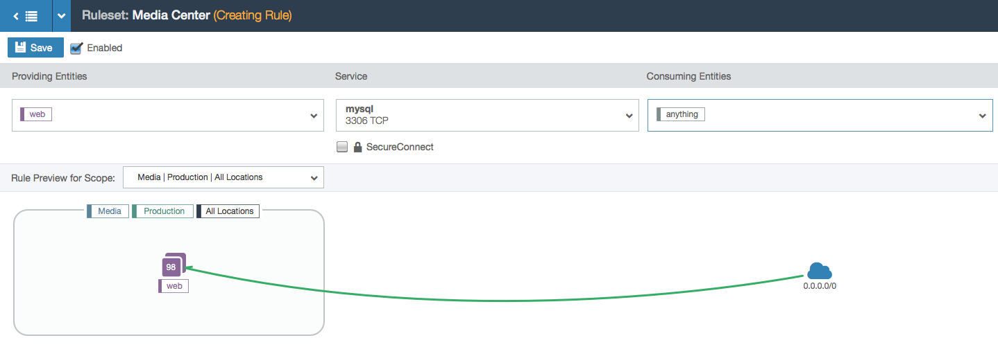
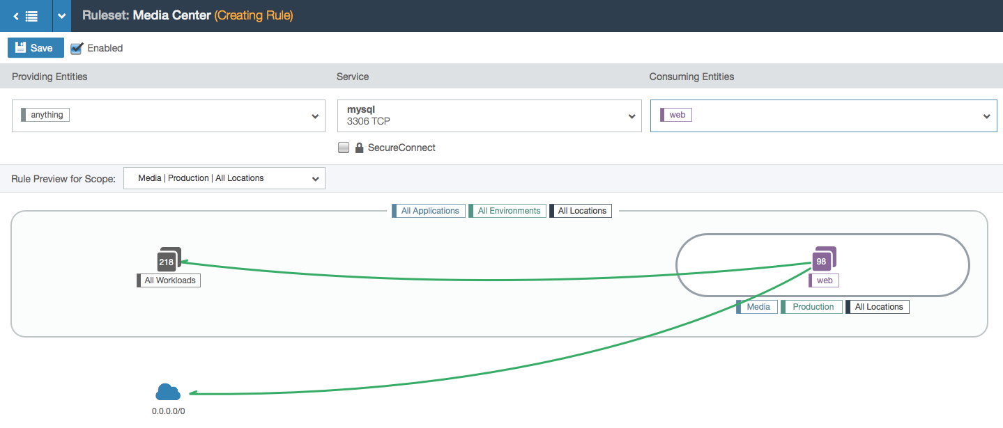
- An example with the “anything” label, which is a system-wide label that is used to represent any IP (the entire internet).
- This example has the ‘anything’ label on the left side.
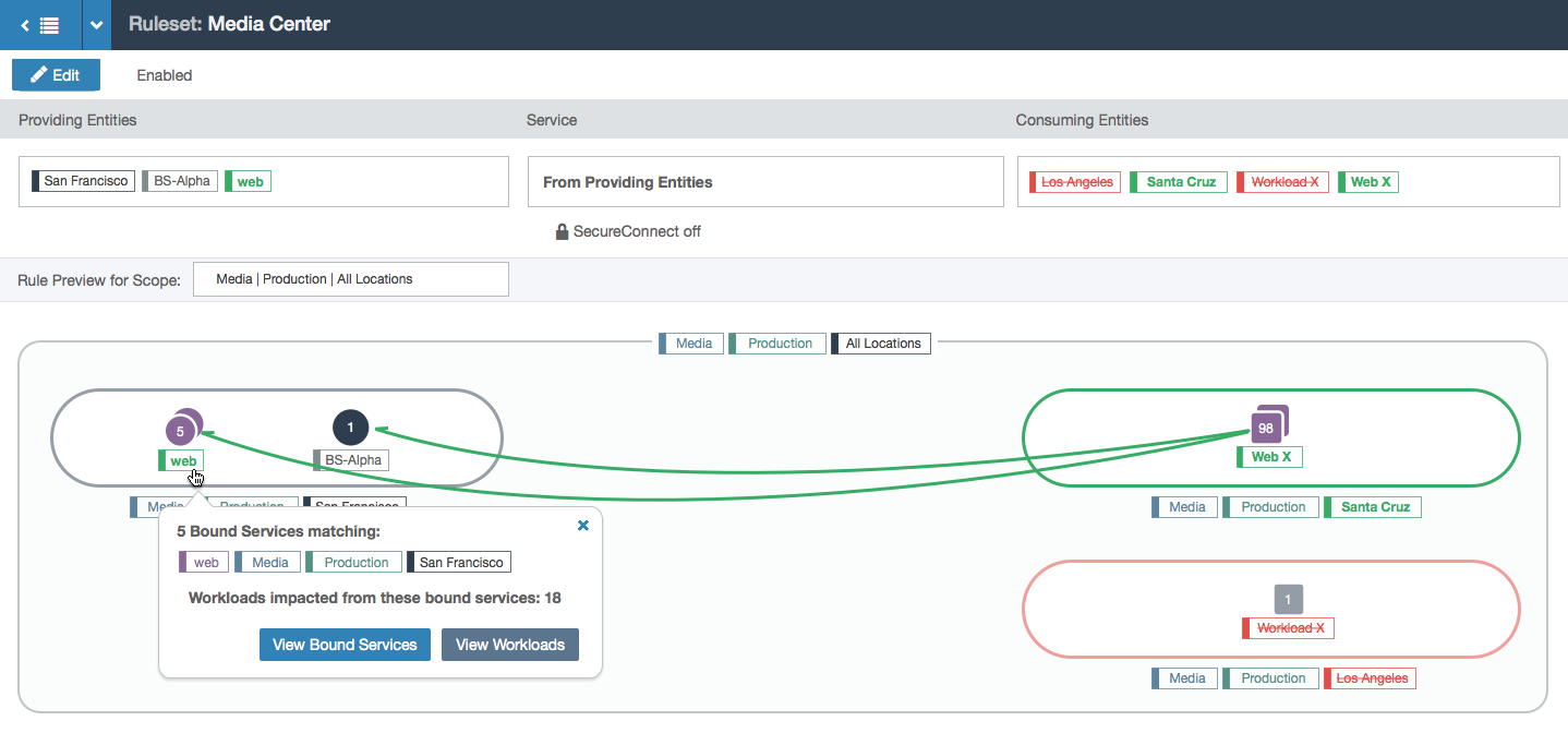
- This example has a different entity type (called a bound service). This example also shows the previous version of the rule (in red) so the user can diff between their current and previous changes to the rule.
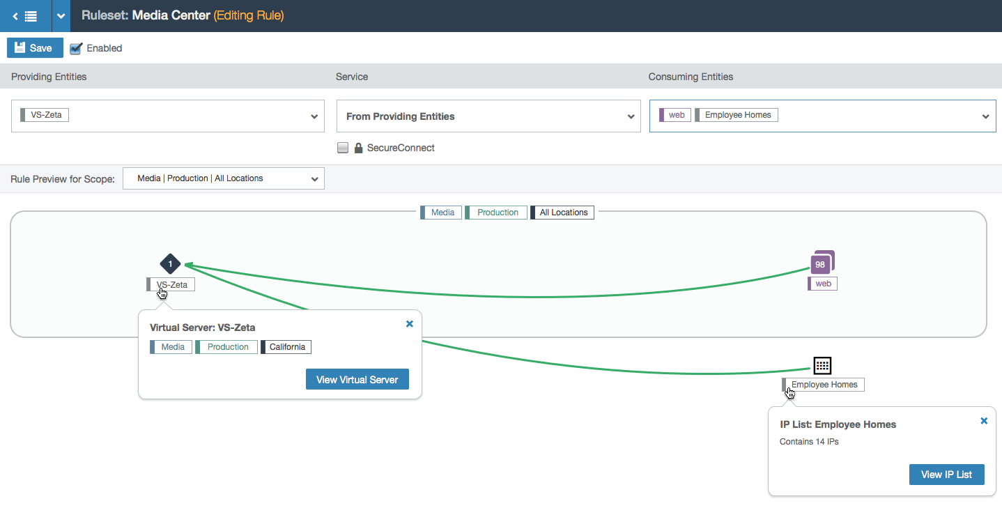
- This shows an example of the node shape for a virtual server (on the left) and an IP list (on the right), which is a user-defined list of specific IP addresses.
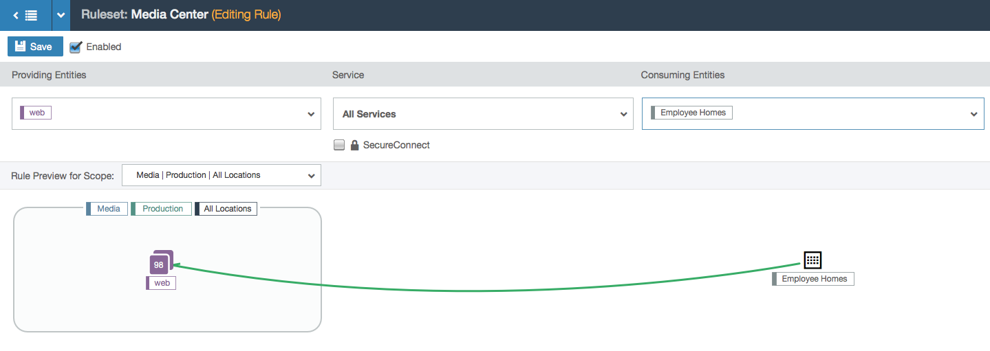
- A simpler example with an IP list.
Design Synopsis
As the user makes changes to parts of the rule, she gets live feedback in a visualization that connects lines between selected groups of workloads. The details in the visualization show the user how a small change can have a large impact in a single rule.
Other Explorations
To give you a sense of my belief in iteration, here is a design concept that didn’t make the cut. I believe in failing fast and failing early in order to reach an ideal design as quickly as possible.
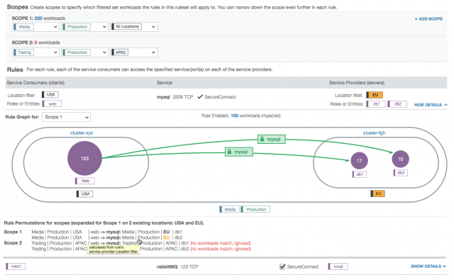
This concept labels the service on the green lines but research showed that this was unnecessary. It also explores using different sizes for groups with different numbers of workloads, which was overkill since the numbers sufficed. There is also a summary at the bottom that we found was too distracting to the user’s overall understanding. I also explored highlighting labels of the same value, which seemed useful.

