My Role
I’m a Senior User Experience Designer at NETGEAR where I lead the design and vision of the Insight web and mobile apps. Insight provides users with detailed information about and remote access to their networks across multiple locations. You can learn more about Insight here. For the past two years, I lead a team of designers to make major visual and interaction design improvements to both the web and mobile apps. I am also a visionary for the execution of new features. I’ll go through some of the improvements we’ve made since I’ve been here (focusing on the web app for simplicity).
My Responsibilities
As the only senior designer for Insight, I’ve worked mostly in a lead designer capacity. I hold weekly design review meetings with our junior designers to review their work and provide feedback. I also hold a weekly design meeting with my manager and relevant product managers and VPs to review current features and discuss upcoming features.
In my first year at NETGEAR, I turned my team from a waterfall environment to an agile one. We now have regular sprints and retrospectives and work closely with Jira to track our tasks and progress.
In addition to leading the design of Insight, I recently started prototyping UI components (navigation headers, buttons, dropdowns, etc.) in React. This allows me to combine my love for both design and development in a way that utilizes my recently conferred M.S. in Computer Science degree (with a focus on HCI). By prototyping key components, we are able to create an interactive style guide that gives our developers easy access to what they need. It also allows us to easily change the theme of our components so we can unify the look and feel of our products across different verticals. I took it upon myself to start prototyping and it is a much-appreciated initiative on our team.
Style Guides
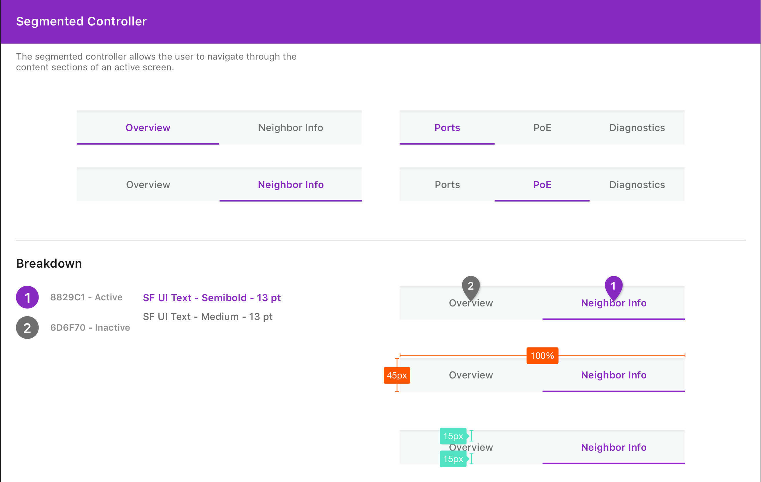
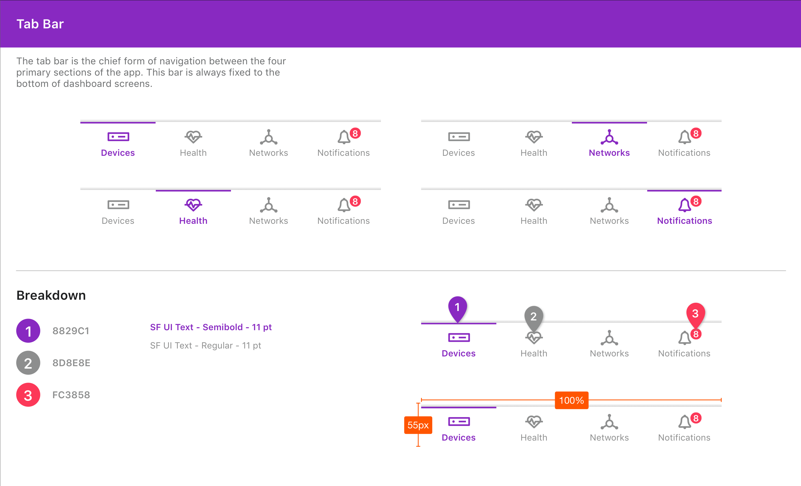
A crucial part of our product’s smooth development is ensuring that we have a thorough style guide that our developers use to keep our UI consistent. Below are some examples of the components we created to ensure brand consistency.
Old to New Designs
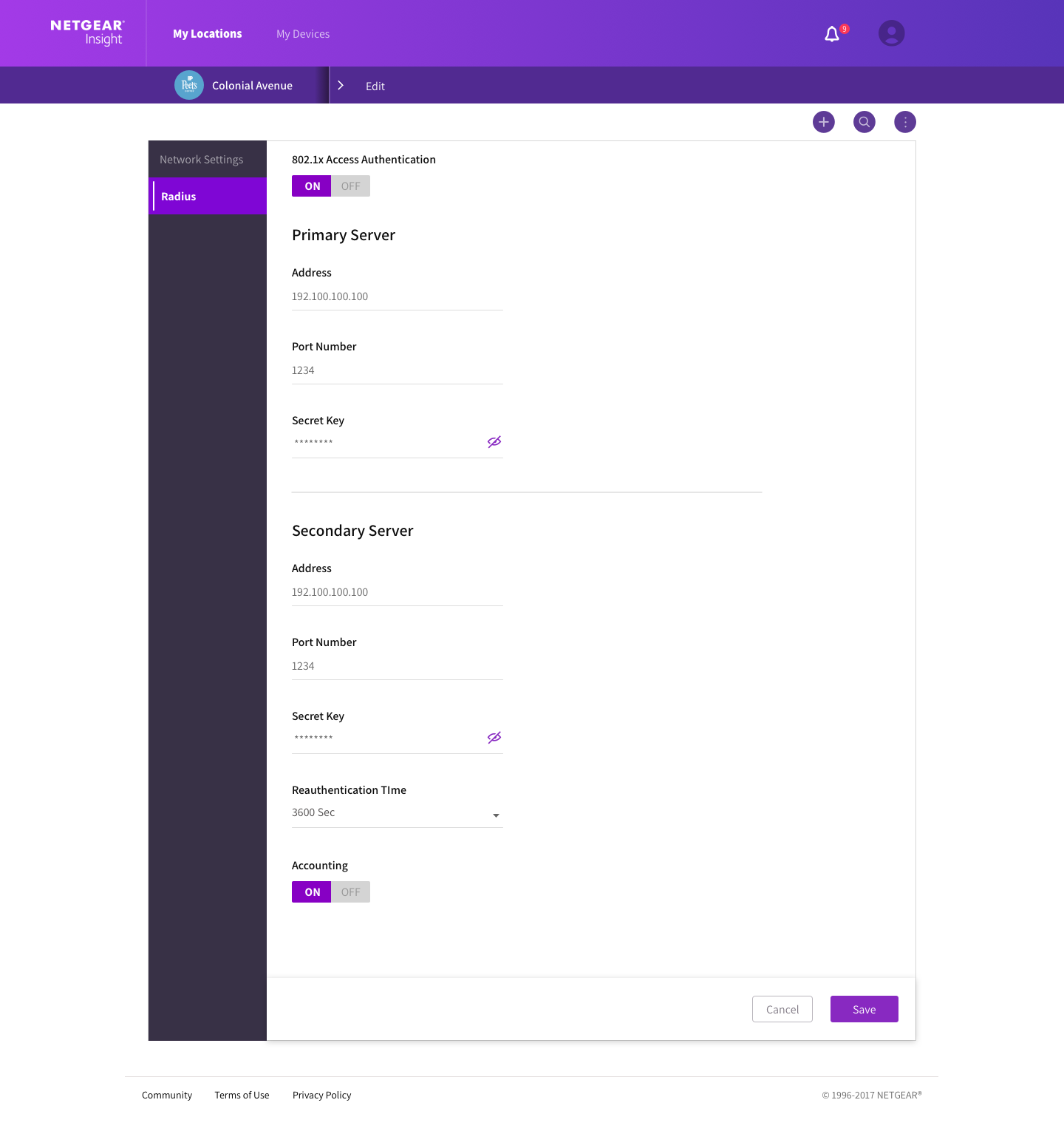
When I first joined the company, there was an outdated and overly-purple design in place that I worked with the team to improve. There were also a lot of inconsistent patterns. We worked to consolidate the design components, simplify the purples, remove distracting gradients, and clean up the overall design of the product. Below are some before-and-after web app screens as an example. (Click on the images to expand them.)
The header featured a very busy gradient and purple was the only call-to-action color used. Users had trouble knowing what to focus on when using the app. The dark gradient shown in the second image’s left menu was jarring (too much contrast). Different purple hues were also introduced for some reason (different shades of purple for the highlighted item in the left navigation and the toggle button right beside it, for example).
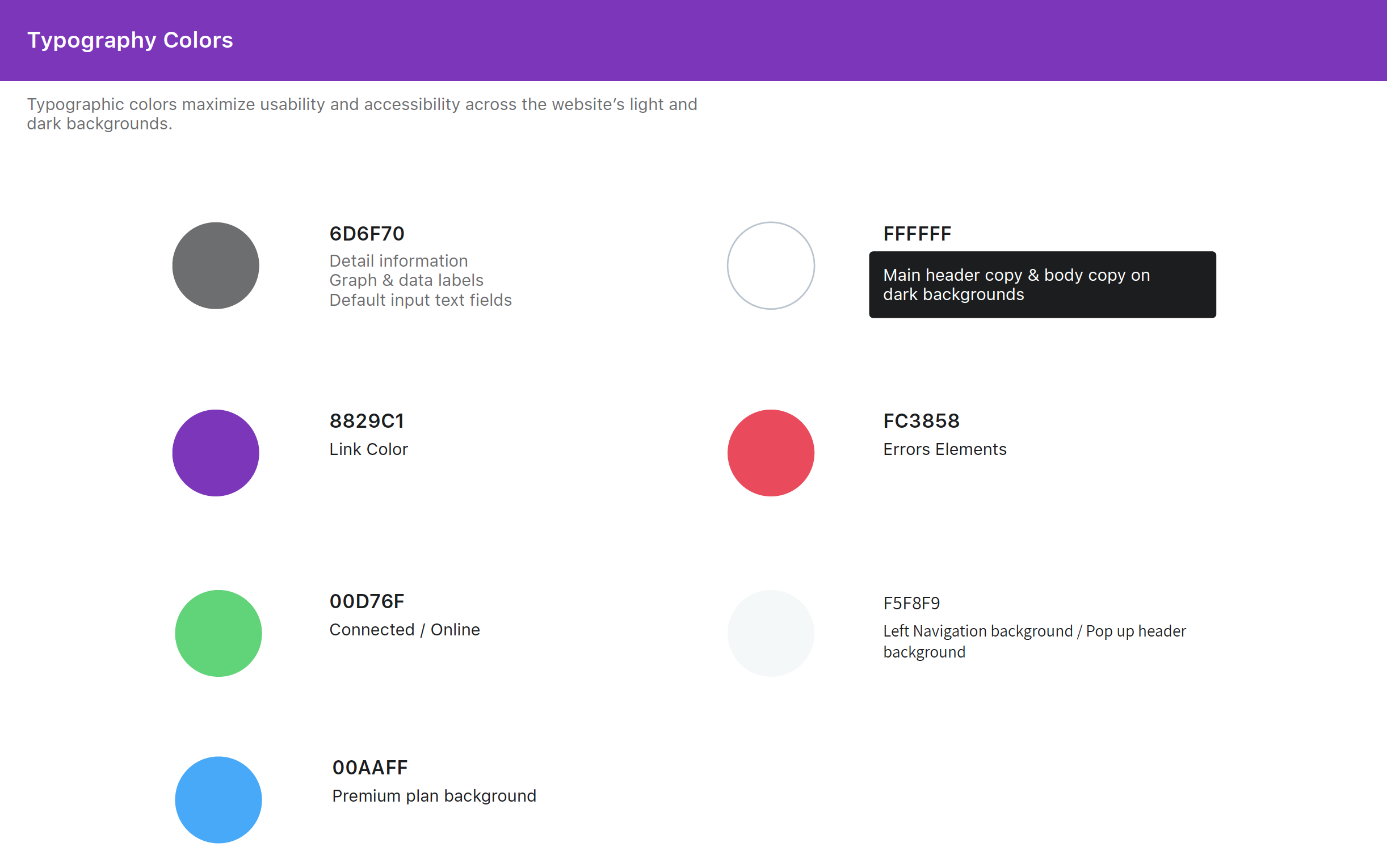
To fix these issues, I worked with the team to remove the gradients and introduce primary and secondary colors to our style. We had to keep the header purple to comply with marketing requirements but we were able to streamline the purple in a single dimension and add other colors to improve the design. This helps users’ mental models as they interact with our app.
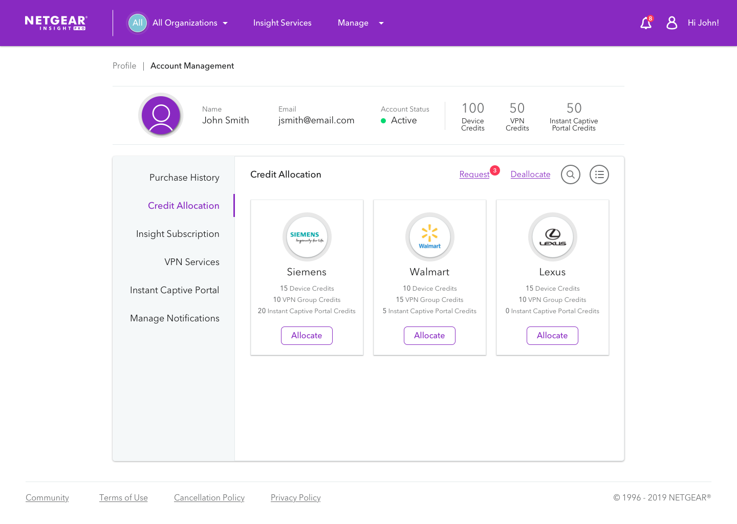
Updated header with removed gradients.
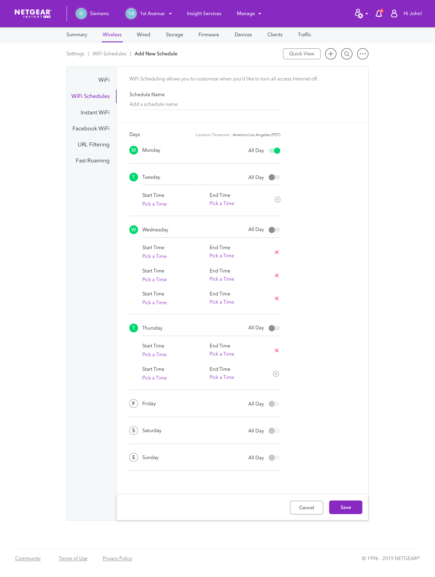
Improved toggle buttons.
Here is our updated color palette:
Feature Highlights
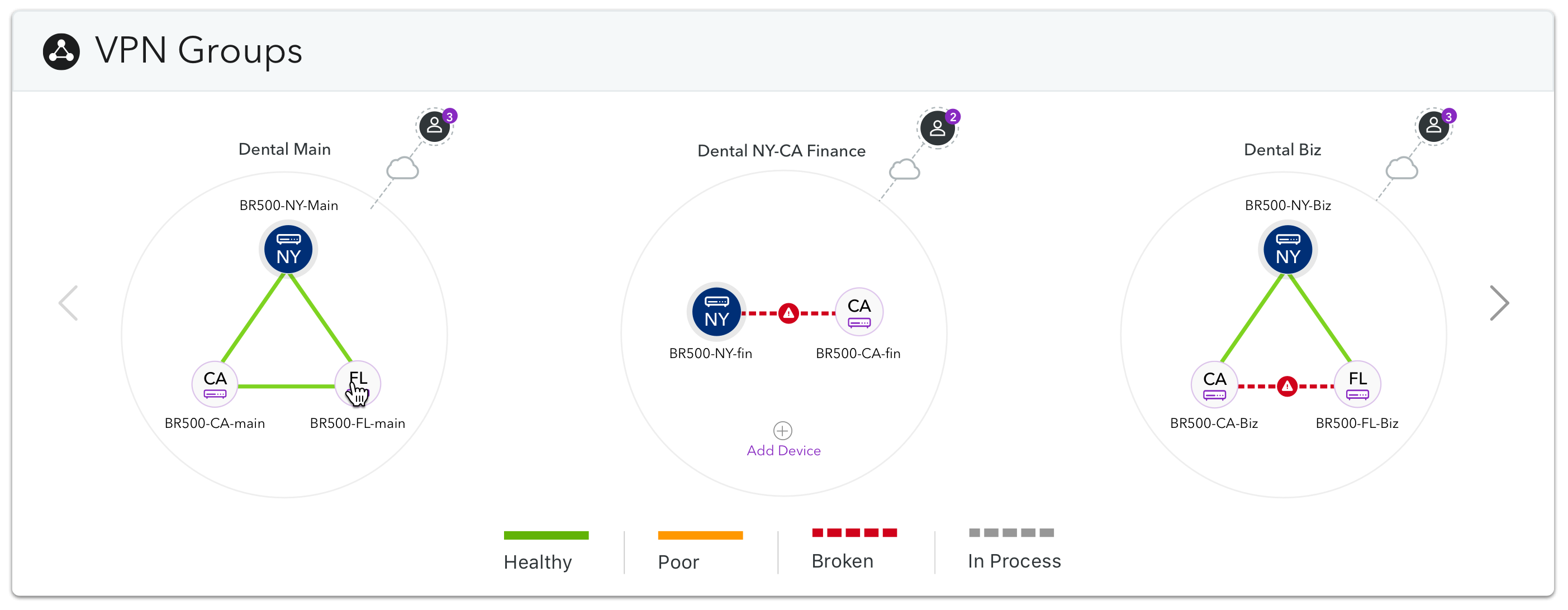
I’ve worked with my designers to introduce several key features, including VPN groups. Users can manage their networking devices in Insight, including routers. Particular routers, such as the BR500, support a feature called VPN groups. VPN groups is a feature that allows users to connect a router to a virtual private network (VPN) that consists of up to three routers across multiple locations. Each router can support up to ten concurrently connected users for a total of thirty possible users.
I led the vision for this feature, using my knowledge of graph theory and my understanding of the feature to explore different design options. Below is a document that I created based on the product manager’s requirements for the feature. It explores potential VPN group configurations and explores questions about the feature.
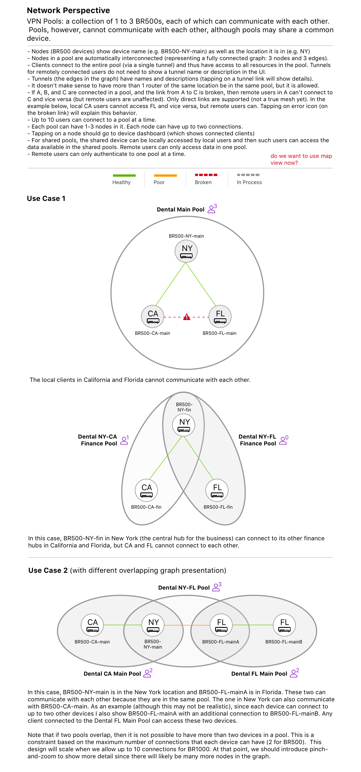
VPN Group design exploration
I sketched several concepts during this process; one such concept is shown below.
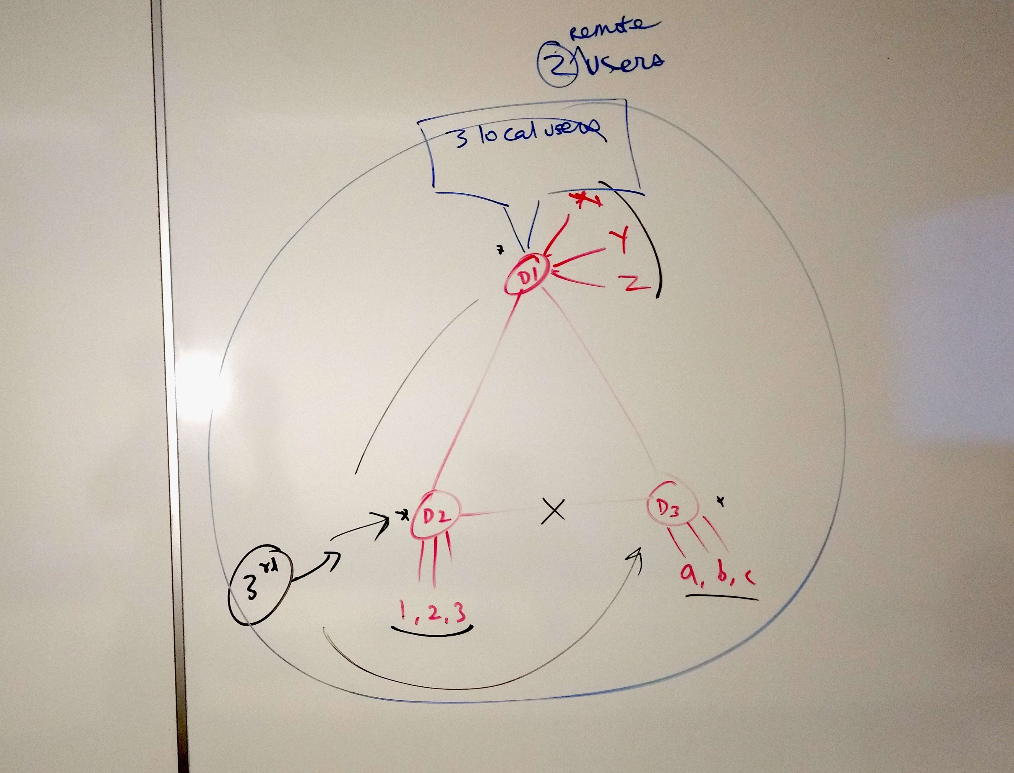
VPN Group sketch
The final design incorporates a lot of my concepts. I worked with my designers to get the feature to an intuitive and visually sound state.
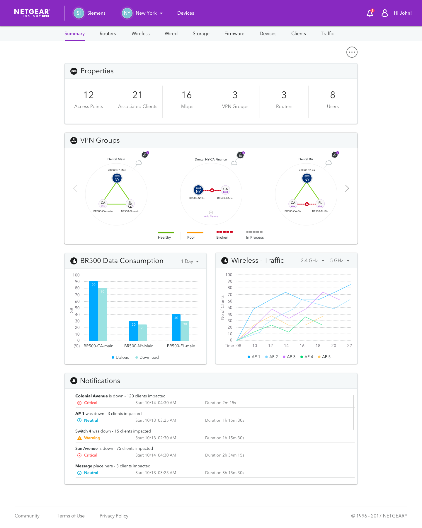
VPN Groups feature
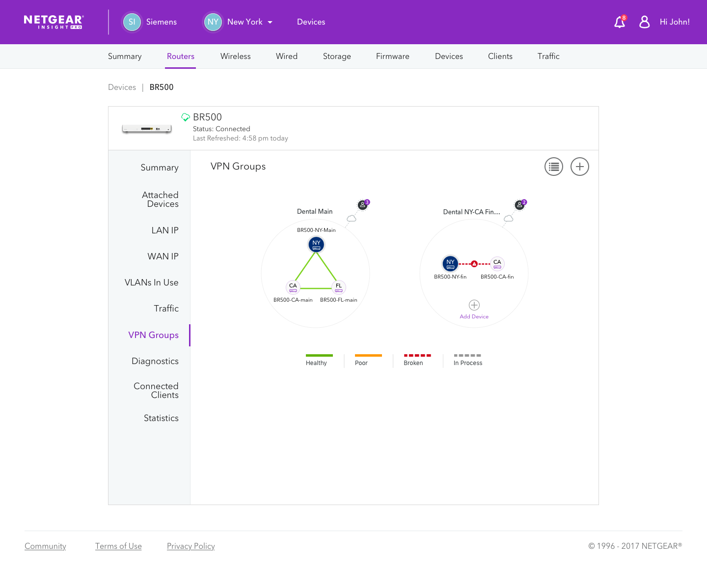
VPN Group details
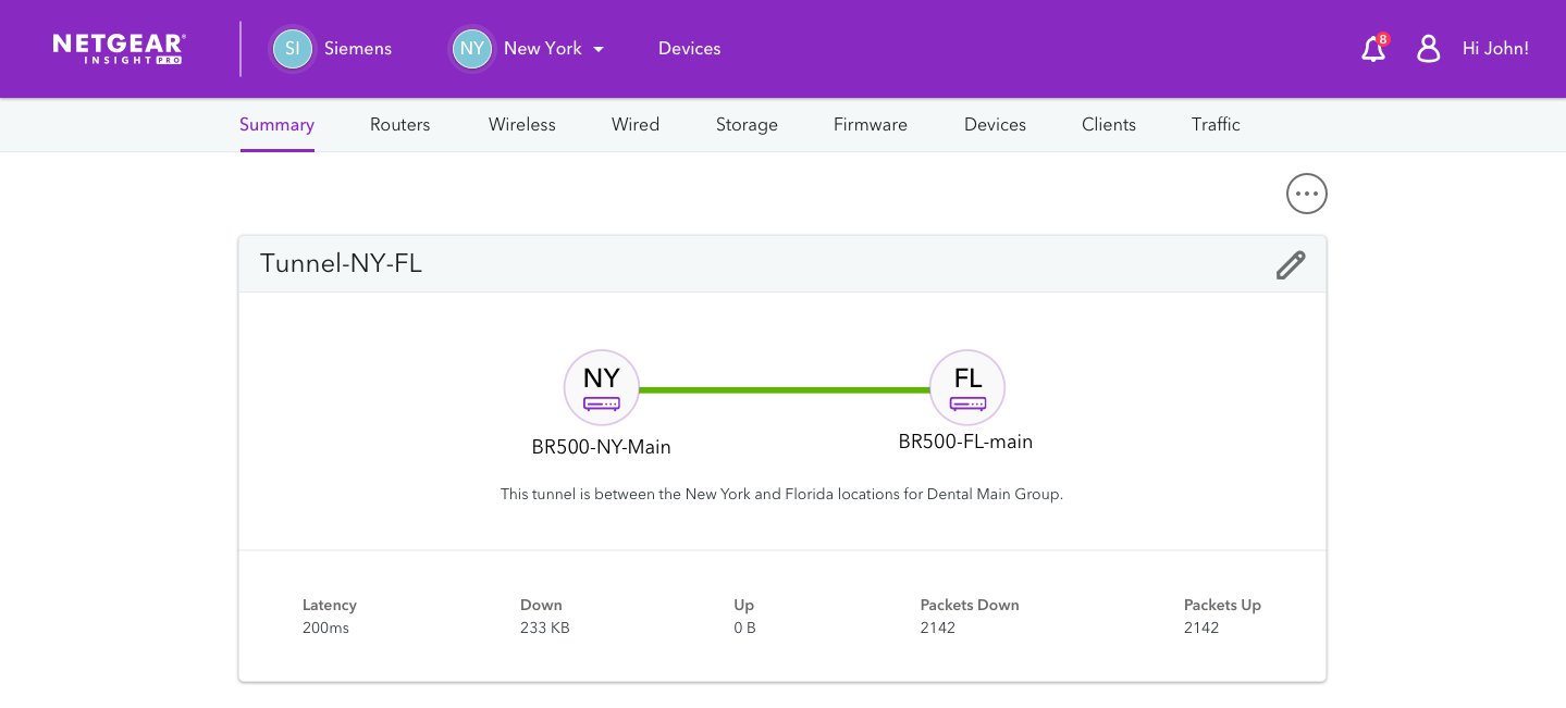
VPN Group tunnel details
Summary
I’ve been involved with a lot of Insight’s key improvements, ranging from standardizing a style library that has consistent components and a refined color palette and prototyping key UI components to managing junior designers and improving our team’s design process. It is always exhilarating to see how far our product has come!
